Design that ships in code not just in Figma slides

We design brand identities, product interfaces and conversion flows on top of a shared token and component system, so what you approve in Figma is what goes live in production.

Design system drawing: design tokens for colour, type, spacing and motion feed a shared Figma and code component library that powers web, product and mobile interfaces with WCAG 2.2 AA accessibility design.system.blueprint tokens · figma · code · a11y 01 · SHARED DESIGN TOKENS (SINGLE SOURCE) Barlow Condensed + Barlow 4px grid · 22px radius · 220ms ease 02 · FIGMA LIBRARY Variants Auto-layout Prototypes tested with users 03 · CODED COMPONENTS React / Astro Storybook Zero drift from Figma MARKETING SITELanding pagesCWV 99 · fast PRODUCT UIDashboards & flowsKeyboard first MOBILE & ADSiOS / AndroidSocial templates WCAG 2.2 AA · CONTRAST >= 4.5:1 · KEYBOARD & SCREEN READER VERIFIED

PAPER TO PRODUCTION

From rough user flow to coded component library

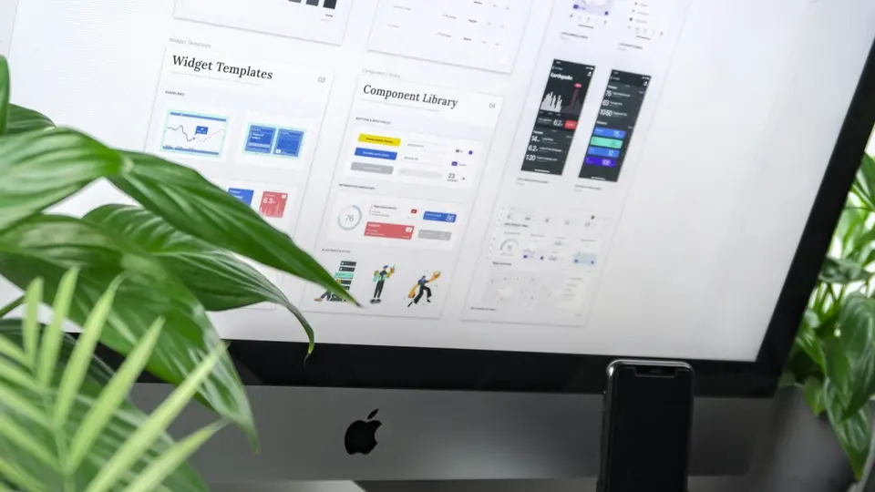
Component library and widget templates on a studio monitor
Component system Every button, card, form and state documented and wired to code tokens
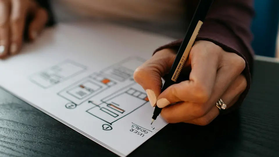
Designer sketching user flow wireframes on paper
Flows before pixels We solve the steps and copy on paper before polishing the visual layer
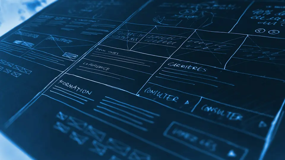
Architectural wireframe blueprint of a web platform
Information architecture Clear navigation and page hierarchy that users understand on the first visit

TOKEN ARCHITECTURE

Five layers that keep Figma and code in sync

Tap any layer to see its job in the system.

Layer 01 · Primitive tokens

Raw colour, type scale and spacing values. Named by scale, never by where they are used.

color.iris.100 = #e6e1f9 · space.4 = 16px
Build this for my product ↗

WHAT WE DELIVER

Brand, product UX, design systems and accessibility

01

Brand identity and visual direction

Typography, colour, art direction and voice that feel calm and unmistakable.

We design or sharpen your visual identity so your website, product, pitch deck and ads look like they come from the same company, with clear rules anyone on your team can follow.

Visual identityTypography & colourBrand guidelinesArt direction
Refresh my brand ↗
02

Product UX and conversion flows

Onboarding, dashboards, checkouts and complex workflows made simple.

We map user journeys, cut unnecessary steps and prototype the hardest screens in your product or site. Tested with real users before engineering spends weeks building them.

User flowsInteractive prototypesOnboarding & checkoutUsability testing
Redesign a key flow ↗
03

Design systems in Figma and code

One component library shared by designers and engineers.

Figma variables wired directly to CSS and React/Vue/Astro components, documented in Storybook. A change in the design system updates the product without manual copy-paste.

Figma variablesToken pipelineReact / StorybookZero drift
Build a design system ↗
04

Accessibility (WCAG 2.2 AA) and UX audits

Pass enterprise and EU accessibility requirements and fix conversion friction.

Screen-reader, keyboard, contrast and form checks across web and mobile, delivered with exact code fixes so you meet WCAG 2.2 AA and European Accessibility Act obligations.

WCAG 2.2 AAEAA readinessKeyboard & reader auditCode-ready fixes
Book a UX & a11y audit ↗

WAYS TO START

Fix key screens, build the system or embed a designer

Fastest impact

UX & Conversion Tear-Down

Fix the three screens or flows where users get confused or drop off.

2 weeks
  • Audit of top 5 screens or flows
  • Redesigned Figma prototypes
  • Accessibility & mobile check
  • Developer-ready handoff
Redesign my key screens ↗
Most asked

Brand + Design System

Visual identity, Figma library and coded component kit delivered together.

6 to 8 weeks
  • Brand direction, type & colour
  • 5-layer token architecture
  • 30+ Figma & coded components
  • Storybook documentation
Scope a design system ↗
Ongoing

Embedded Product Designer

A senior product and brand designer working inside your weekly sprint.

Monthly
  • New product features & screens
  • Landing pages & campaign visuals
  • Design system maintenance
  • Direct Slack & Figma collaboration
Add a senior designer ↗

Adjacent disciplines

Brand · UX · System

Ready for a design system thatengineers actually love using?

Share your product or site URL and what feels broken. We reply with a UX tear-down and fixed scope.